
In the rapidly shifting landscape of social media and web development, change is the only constant. However, as we track digital innovation here at Digital Tech Explorer, some platform updates leave even the most seasoned tech enthusiasts scratching their heads. The latest move from X regarding its user interface themes is a prime example of a decision that seems to defy the logic of modern software engineering.
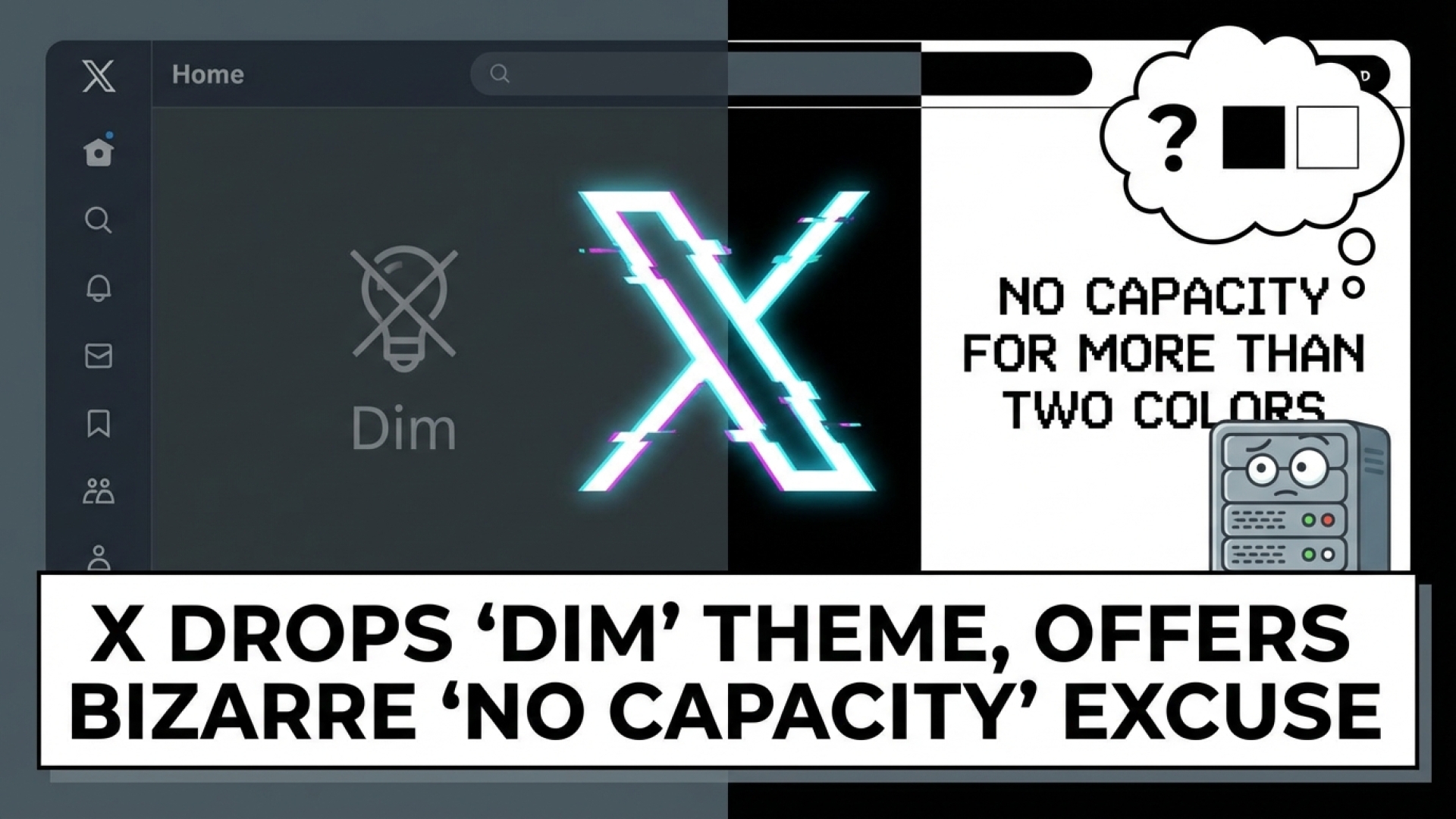
X Removes ‘Dim’ Theme Citing “No Capacity”
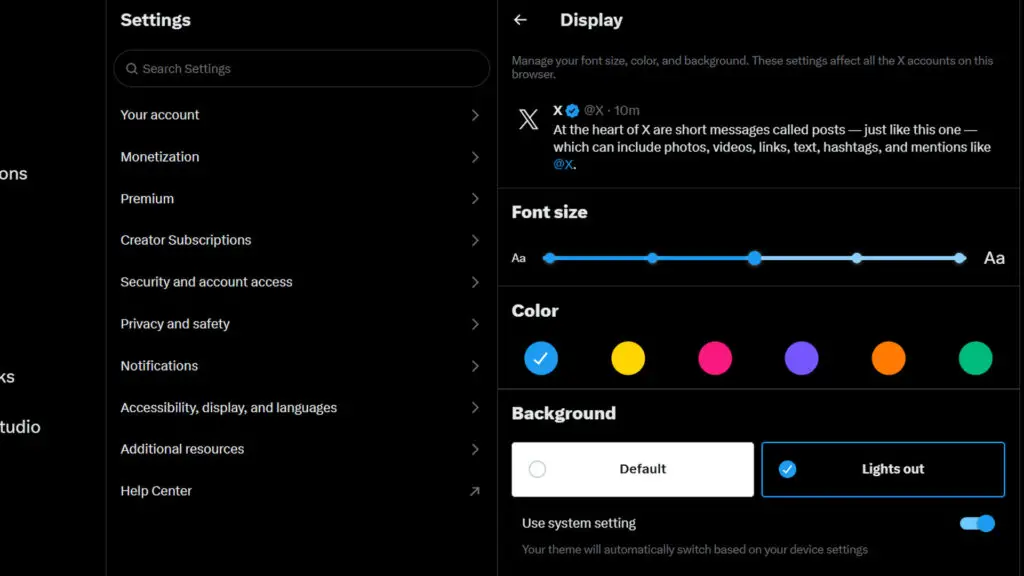
The controversy began with a post from Nikita Bier, X’s Head of Product. In response to users asking why the platform’s aesthetic options were slashed from three to two, Bier offered a surprisingly candid—yet confusing—explanation. The official stance is that the platform simply lacks the “capacity” to support more than the default light and “Lights Out” dark modes.
We don’t have the capacity to support more than two colors right now. But feedback noted: we are looking into lightening the black on web.
Nikita Bier
The Technical Puzzle of “Limited Capacity”
From a technical perspective, this justification is difficult to reconcile with the scale of X’s infrastructure. In the world of web development, maintaining a CSS-based theme requires minimal resources once the initial design is implemented. For a platform that manages massive global data streams, the claim that a third color palette exceeds their capacity feels like a narrative from an earlier era of the internet.
A Step Backward for User Experience
The missing “Dim” mode wasn’t a experimental new feature; it was a legacy favorite from the Twitter era. Many users preferred this middle-ground option, which provided a softer, navy-blue aesthetic that reduced eye strain without the harsh, high-contrast “true black” of the current dark mode. By removing this, X has arguably degraded the user experience for those who spend significant time navigating the platform.
Mixed Signals and Future Customization
There is a glaring inconsistency in Bier’s statement. While claiming the team lacks the capacity for a third theme, he simultaneously mentioned that they are “looking into lightening the black on web.” This suggests that design resources are available to tweak existing styles, making the removal of a pre-existing, functional theme even more baffling. For a platform aiming to lead in emerging technology and digital trends, this reduction in customization feels like a step in the wrong direction.
At Digital Tech Explorer, we believe that software should evolve to offer more choice, not less. As we continue to follow the stories behind the code, we hope to see X return to a more user-centric approach to its interface design.
For more insights into the latest tech news and digital innovation, visit our TechTalesLeo author page.