

As any seasoned player of a looter shooter knows, the relentless acquisition of gear—guns, shields, grenades, and enhancements—is the very heartbeat of the genre. Borderlands 4 certainly doesn’t skimp on the loot, consistently inundating players with new opportunities to refine their arsenal. This constant influx necessitates frequent dives into one’s backpack to strategize, compare, and decide what to keep, what to equip, and what to convert into precious in-game currency. Yet, for a game so fundamentally built upon this routine, the experience of inventory management in Borderlands 4 feels surprisingly cumbersome.
From the perspective of a tech enthusiast and developer who appreciates intuitive design, it’s perplexing how Borderlands 4, several iterations deep, has managed to regress in this crucial area. This article delves into the specific pain points of its inventory system, offering a detailed analysis of where the user experience falls short, as we at Digital Tech Explorer are committed to making informed decisions about the technology and games we engage with.
Ineffective Sorting and Persistent UI Issues
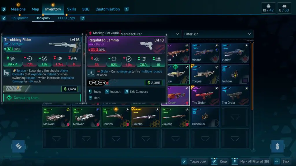
My expectations for an efficient inventory management system are straightforward: it needs to be quick and easy to navigate. Unfortunately, Borderlands 4 struggles on both fronts. Upon opening the backpack, players are greeted with a jumbled collection of items, inexplicably defaulted to sorting by manufacturer. While this might appeal to a niche segment of players, it defies common sense for most, who would prioritize organization by factors like “recently acquired,” “item value,” or “level.” These practical sorting options are either absent or not readily accessible, creating an immediate hurdle.
Adding to the frustration, any custom sorting or filtering applied is transient. Venture to a different menu screen, even momentarily, and the inventory resets to its default, manufacturer-based order. This seemingly minor inconvenience accumulates significantly over time, especially during intense gameplay sessions where quick decisions are paramount. For PC players using a keyboard and mouse, menu navigation, while flawed, is still manageable. However, imagine the added layers of tedium for console players attempting to navigate this inefficient UI with a controller. Every wasted second in the menu is a second not spent engaging with the core action, fundamentally impacting the flow of the game.
Cluttered Display and Tedious Item Comparison
A fundamental design flaw in the Borderlands 4 inventory is the commingling of equipped and unequipped items. Unlike systems that neatly segregate active gear or place it in a dedicated, easily identifiable section, Borderlands 4 scatters it throughout the backpack. This forces players to meticulously hunt for a small, often obscure checkmark to distinguish equipped items from the rest of the loot, a task made more difficult by visually similar icons and new item indicators. It’s akin to sifting through a single laundry basket containing both clean and dirty clothes—an unnecessary and time-consuming chore that detracts from the desired user experience.
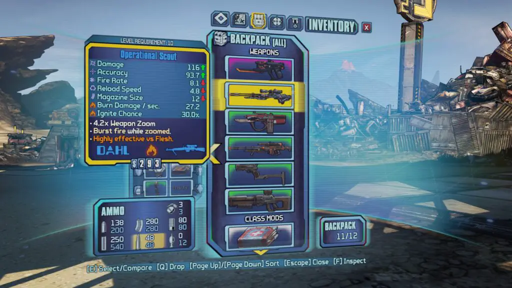
The process of comparing items, a cornerstone of any looter shooter, is similarly laborious. The disorganization of equipped items exacerbates this, making it challenging to quickly identify and compare two specific pieces of gear. To put this into perspective, I revisited Borderlands 2 to assess its inventory management. While not flawless—long scrollable lists had their own drawbacks—it offered a far more cohesive and intuitive experience. The contrast highlights a surprising step backward in Borderlands 4, where the sheer volume of time wasted on inventory maintenance actively discourages loadout experimentation.
Additional UI Gripes and Design Oversights
Beyond the core issues, several smaller yet impactful design choices contribute to the overall frustration with Borderlands 4‘s inventory UI:
- **Dropping Items:** The necessity of a long press to drop items, rather than a quick right-click menu option, adds unnecessary friction to a frequent action.
- **Hidden Currency Display:** Hiding the current currency balance behind a hover-over icon is a puzzling choice. Essential information like money should be visible at a glance, not requiring an active search.
- **Small Weapon Cards:** Despite the inventory screen dedicating ample space, weapon cards are disproportionately small. Enlarging these would significantly improve readability and quick assessment of item stats.
- **Filtering Mechanism:** Rather than filtering out irrelevant items, the system merely darkens them. A cleaner interface would see non-matching items disappear entirely, improving visual clarity and focus.

While some of these points might seem like minor preferences, their cumulative effect is significant: they unnecessarily consume player time. An inventory that is finicky, confusing, and time-intensive is a critical flaw in a looter shooter. It actively hinders the core loop of experimentation and progression. This becomes evident when players, like myself, resort to mindlessly marking items as junk simply to avoid engaging with the inventory screen altogether.
It’s a perplexing regression for an element so central to the gameplay experience of Borderlands. The inventory should be a seamless conduit, quickly ushering players through their loot decisions and back into the action. Instead, it transforms into a sluggish, “swampy” interface, demanding painstaking effort to decipher what’s available. As Digital Tech Explorer consistently advocates for, thoughtful UI/UX design is paramount for an engaging digital experience. When a game opts to move away from iconic diegetic UI for a more generic approach, that choice must be justified by superior functionality. In Borderlands 4’s current state, this is unfortunately not the case.
We sincerely hope that Gearbox prioritizes these inventory and UI issues in upcoming patches. Addressing them would not only enhance the immediate player experience but also affirm a commitment to the quality and depth that fans expect from the series, transforming a current frustration into the smooth, efficient loot management that a title like Borderlands 4 truly deserves.